
Froggies
Client: Froggies Divers
Job Scope: Brand Identity
Comfortably positioned in the middle of its competitors' price ranges, Froggies prides themselves in providing an affordable, yet tailored diving experience to suit the needs of every diver. However, their old logo was outdated and did not match the maturity of the brand, hence the need for a newer, more fun, and trustworthy image.
The task was to refreshen its brand identity to a more mature and exotic image.

Engaging. Exotic. Ethical.
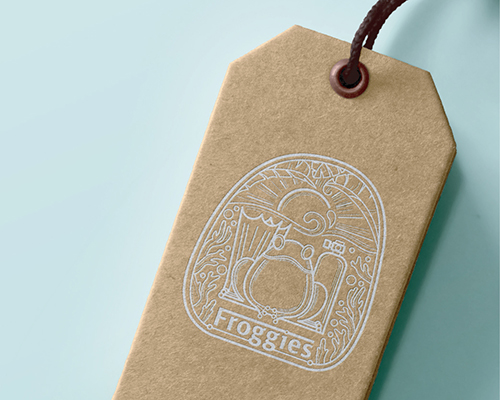
Froggies' image drastically shifted from a childish cartoon brand to a strong pivot around a tropical resort-like image. While retaining the original frog symbol, the new brand identity looks substantially more mature and trustworthy, assuring customers the safest diving experience. The exotic patterns on the new logo also compliments the tropical island that Froggies is on.
Logo Design Proposals

Design 1 (Chosen by Client)
Constructed from circles, the brand takes its inspiration from the natural shapes of mother Earth. The buddy-back pose of the frogs resemble a diver accompanied by an instructor to assure the audience a safe diving adventure. The motif in the frogs are inspired by Bali stone carving, reminding divers of the tropical Froggies experience.

Design 2
Bold, Confident and Respectable. This majestic logo presents itself in a modern and memorable illustration style. A brand you can trust, the logo stands strong against a coral motif to look as proud as a lion's mane, while still reminding the audience of the resort. The boldness of the logo is softened by the rounder typeface underneath.


Design 3
Inspired by bubbles escaping from the regulator, this memorable logo takes the shape of the free diving spirit. The stable triangle that the logo bubbles in assures divers that Froggies is the safe way to go. A humanist and modern typeface was used to compliment the soft logo.
Design 4
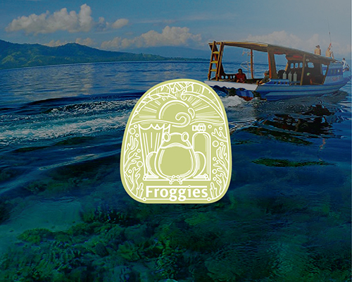
The brand presents all of that would make perfect dive experiences: the sun, the waves, the green of tropical resort, the fantastic underwater world. The logo was created in a format of a classic label, which help to create a trustworthy and prominent brand image.
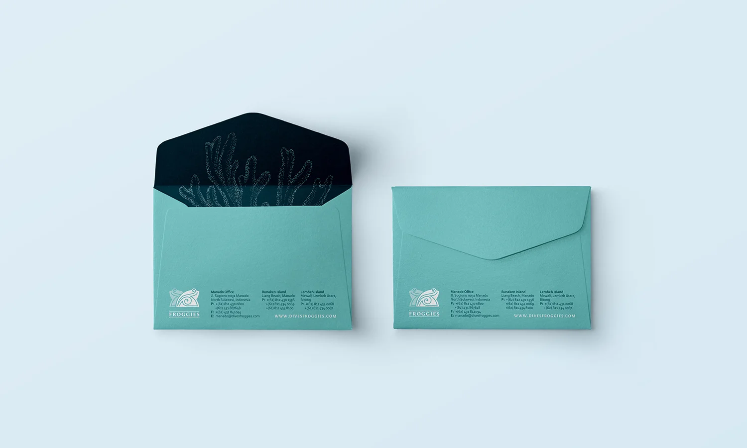
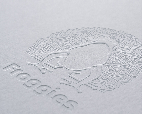
Graphic Signature
As magical as the deep blue down below, the illustrations are drawn in an imaginative style to mimic the free movement of the underwater world. The pointillism method does not complete the full illustration, but instead encourages the audience to fill it in themselves, therefore triggering their imagination as well. Creative cropping of the illustration, and never showing it fully, stirs their brain juice even more.