
Iceman
Client: Iceman
Job Scope: Brand Identity, Packaging Design
Swift, resourceful, and reliable, Iceman’s ice delivery service spans across the whole island of Singapore, 24/7 on all days of the year. A rebranding project that is highly mascot-based, the challenge was to expand on their existing polar bear character, emphasising on speed and movement into their logo to reflect their promptness towards delivery calls.
Logo Proposals

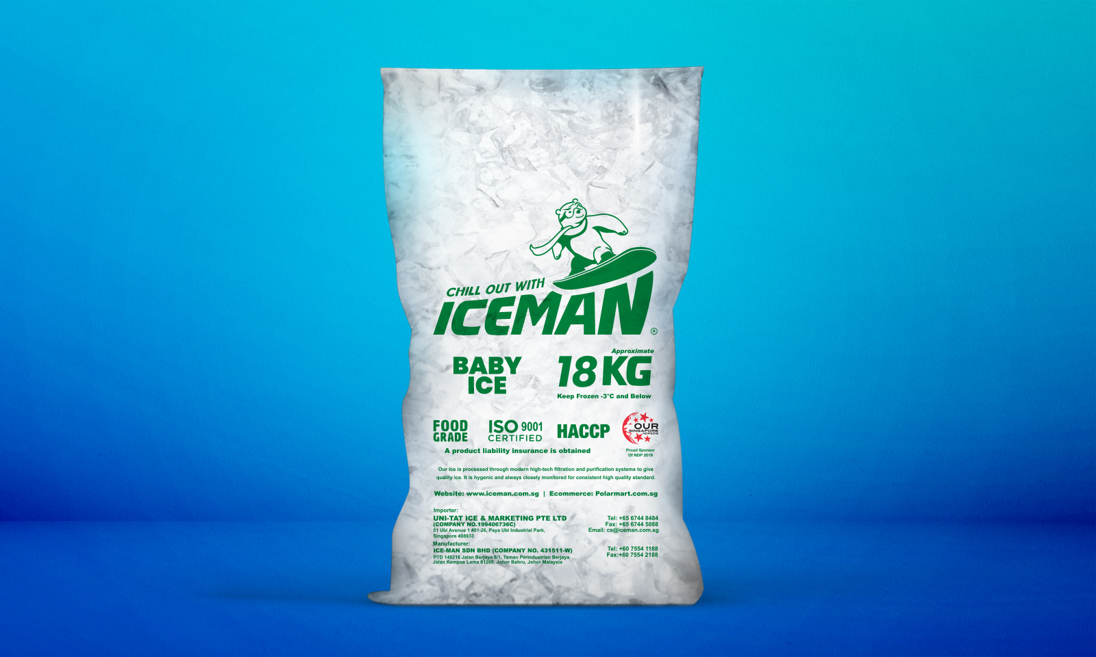
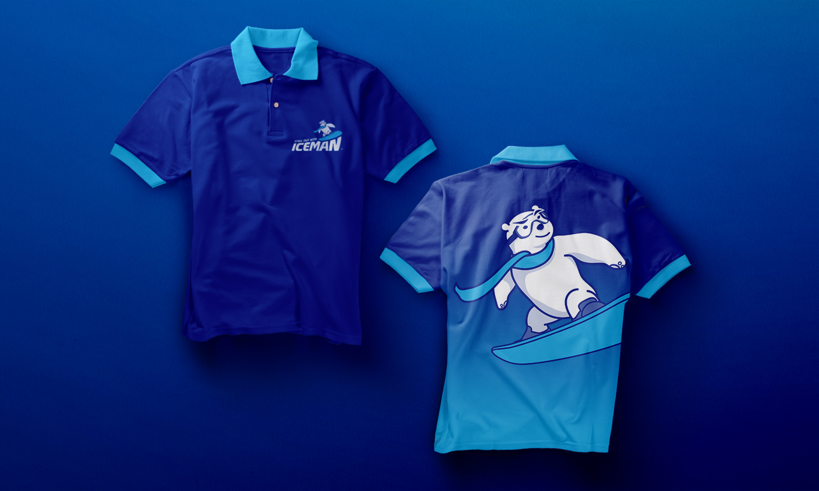
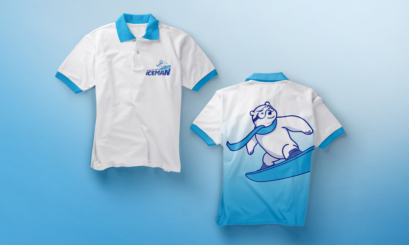
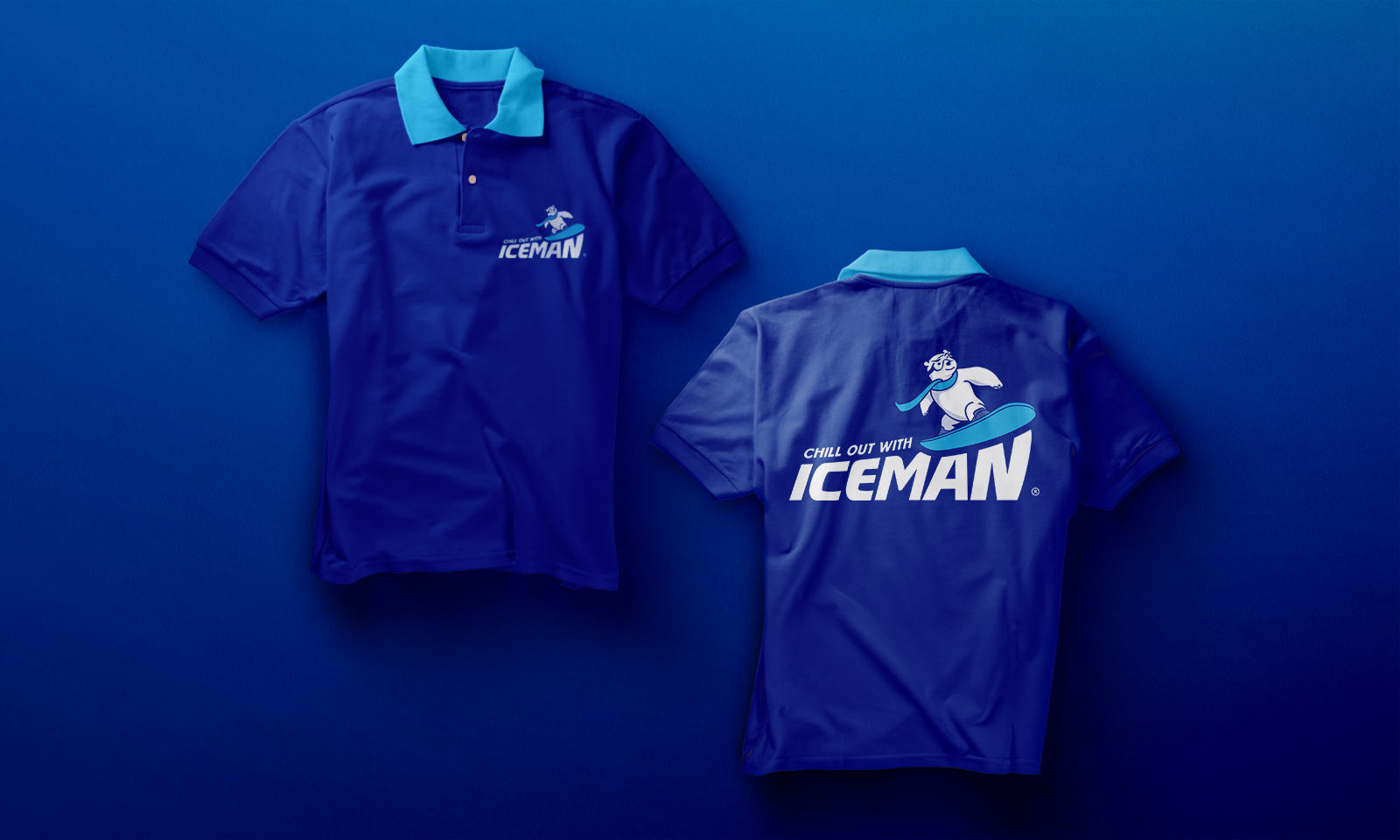
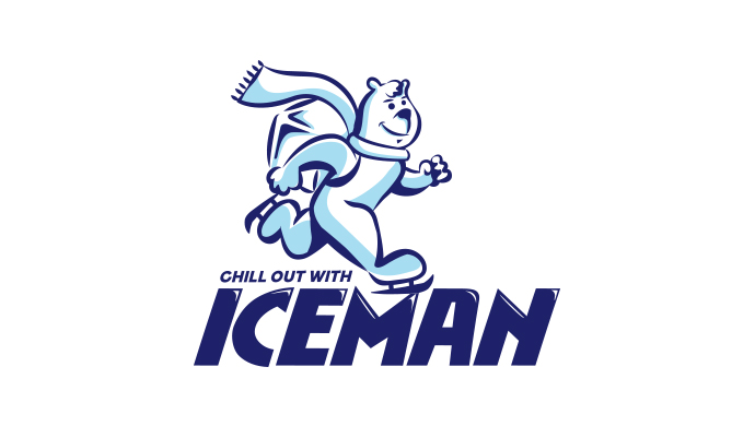
Design 1 (Selected by Client)
The mascot was designed to be amicable, but not childish, welcoming customers from all around the island to ring their hotline. Professionalism is maintained with a sturdy logotype that interacts well with the mascot, emphasising on the polar bear’s acceleration to above and beyond.
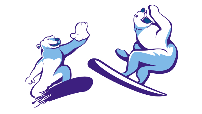
Design 2
This diligent mascot skates nicely over the logotype, with ice on its back for easier recall of Iceman’s one and only product. Highlights were added onto the logotype to enhance the “chill” of the brand.
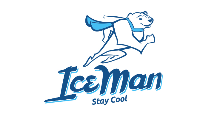

Design 3
A heroic take on the mascot, as Iceman’s 24/7 hotline immediately attends to any ice shortage anywhere. The semi-cursive logotype was customised to emphasise on “IceMan” being the hero’s name, as well as add even more momentum to the mascot.
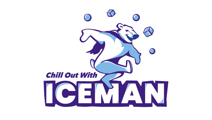
Design 4
Iceman’s variety of ice shapes and sizes are displayed in the juggling motion of this mascot. Unlike the typical snow activities, this mascot shows off the brand’s fun side with a circus act, standing out from the rest of the proposed designs.


Design 5
Executed in a more organic illustration style, this mascot does not fit into the traditional “western cartoon” mould, and instead gives the brand its own unique graphic approach.