

Kele Singapore
Client: Kele Singapore
Job Scope: Brand Identity, Packaging Design
It takes a handful of creativity, several cups of dedication, and countless charred ovens of failures to finally knead a masterful pineapple tart out of simple ingredients. After 30 years of craft, Kele was crowned as Singapore's #1 brand for pineapple tarts while they were just an online store. Now, they want to set up their first outlet in one of Singapore's densest locations, Chinatown.

Copyright Complications
Born before the age of information, Kele, back then better known for their Chinese name 可乐 (ke le), did nothing to register this joyous moniker. For a moment then, there seemed to be no clouds on the horizon. 可乐 (ke le) was prospering.
Upon the time of globalisation, 可乐 (ke le) could not register their name without infringing copyrights on another identical sounding fizzy drink brand. Come hell or high water, Kele needed to uphold its legacy, different name or not. Eventually, 可 (ke) was dropped and only 乐 (le), meaning joy, remained. The identity also became more pineapple-centric as the former bakery started prioritising their pineapple tarts.
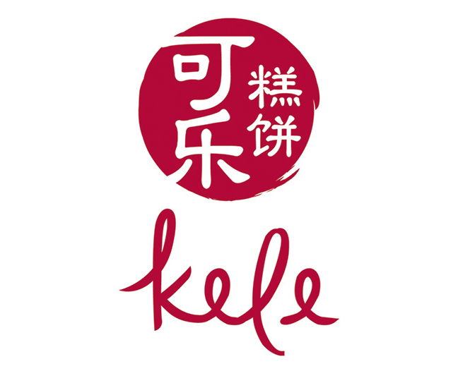
Logo Design Proposals
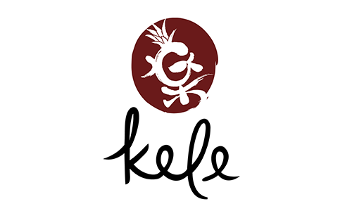
Design 1
The pineapple design is incorporated into the 乐 (le) character (using the traditional writing). Calligraphy strokes express Kele's rich history.

Design 2 (Chosen by Client)
The 乐 (le) character is enclosed inside a pineapple, with the Chinese font styled similar to the English 'Kele' below.
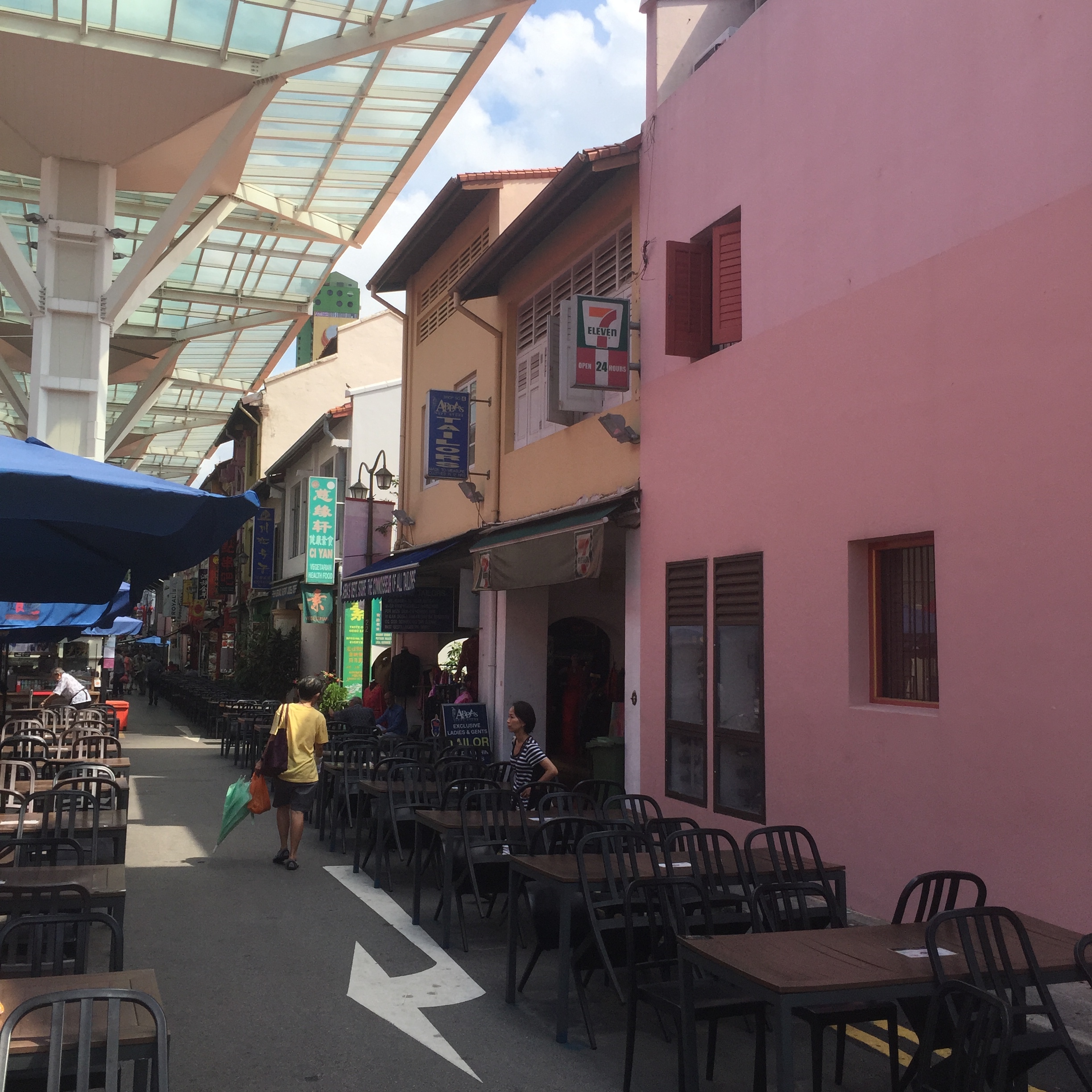
Location Study
An area with such high foot traffic comes with a saturated competitor market. And to add oil to the fire, plenty of these stores sold pineapple tarts as well. Kele's crown of 'Voted #1 Pineapple Tarts in Singapore' wasn't loud enough to compete on its own, and they needed rocket fuel to stand out from the crowd. Kele's store would replace the 7 Eleven in the pictures below.


Introducing Tropical Kele
There was one thing that every store in Chinatown had in common, an oriental look. A given, due to the name of the place. A Chinese-looking pineapple tart store would just be another one under the sun. Trudging off the beaten track, Kele's new identity strayed from the typical Asian design to the pineapple's source of origin- the sunny tropics.

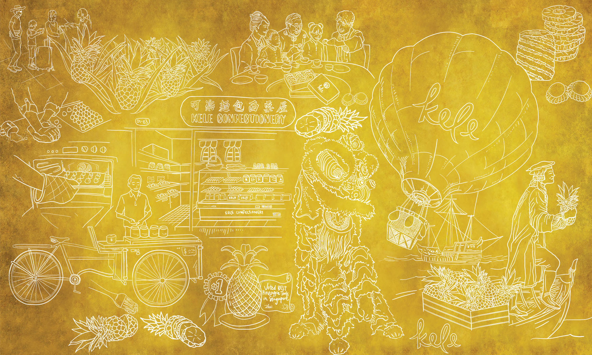
Interior
A striking yellow is introduced to draw attention to the store, as well as compliment the tropical theme. As the #1 brand of pineapple tarts in Singapore, the accent wall mural on the left walks customers through Kele's hard work since their humble beginnings to their spot on the throne.
Spreading the Gift of Gold
Having grown from a humble pastries to the best pineapple tarts in Singapore, Kele intends to spread their treats to the rest of the world.
With packaging that tells the story of Singapore, tourists from all arund the world can now spread these golden tarts as a memento of our Lion City.

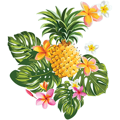
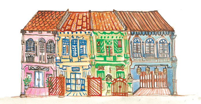
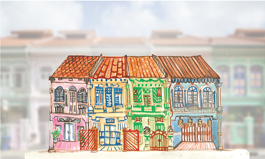
Tourist Package
Inspired by Kele's history of handmade pineapple tarts, hand-drawn watercolour illustrations were used to add a human touch to the packaging. As this tourist pack would be sold on top of Kele's regular packaging, the USP wouldn't be the pineapple tarts, but Singapore itself. A tinge of digital art was then added to add interest to the piece. This mixed media packaging stands out with its expressive juxtaposition of Singapore icons, for tourists to bring home as a souvenir.
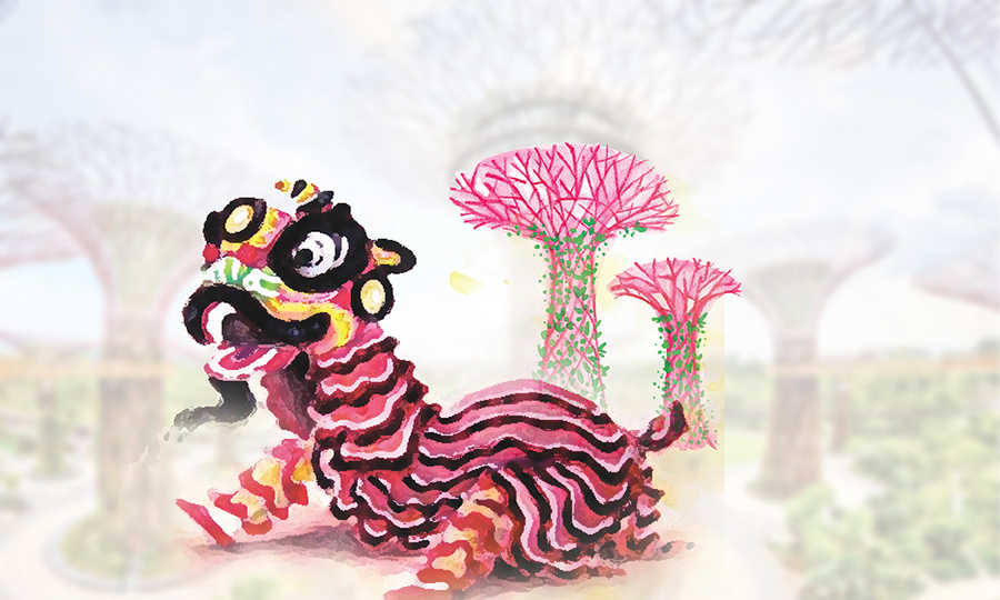


Chinese New Year Sleeve
No pantry is complete without these golden tarts during Chinese New Year, hence their tenfold increase in popularity during this festive season. Lion dances are also on of CNY's most anticipated performances. The majestic lion sleeve flowing down their existing pack celebrates this joyous occasion with their customers, as both a gift and house decoration.
Summary Block