

Natasha Skincare
Client: Natasha
Job Scope: Rebranding, Packaging Identity
Helmed by skincare expert, Dr Fredi Setyawan, Natasha's lead in Indonesia's skincare industry has been reigning for 6 years and is still going strong. However, with paradigm shifts in technology these few years, as well as a new generation of youth target audience, Natasha's old logo was no longer befitting of their high-tech products. To stay on top of their throne, we revamped their brand while retaining it's familiar essence to the existing market.
Simple. Serene. Sophiscated.
Donning a newer, softer, logotype, Natasha's brand was prominently elevated to a more mature, yet amicable character. Another prominent change was the brand's colour palette, from its primary pink to a more gender-neutral grey and gold, to welcome males into their target audience demographic. Accompanying the minimalist logotype was a simplified and geometrical version of their face icon. Overall, this new logo opened the doors to a wider range of target audience, from youths to working adults, and gives Natasha the serenity and professionalism their previous logo never had.
Proposed Designs

Design 1 (Chosen by Client)

Design 2

Design 3

Design 4
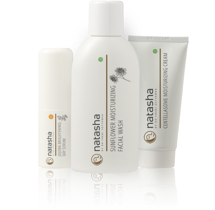

Packaging System
Alongside their strewed logo was an untidy packaging system. Customers had a hard time differentiating the products, and often mixed them up. Furthermore, such a plain packaging provided no way of showing off the product's USP. The packaging system for different categories (women, men, teens, etc.) was not coherent with their brand.
The task was to create a coherent, simple, and recognisable system for their expansive range of products.


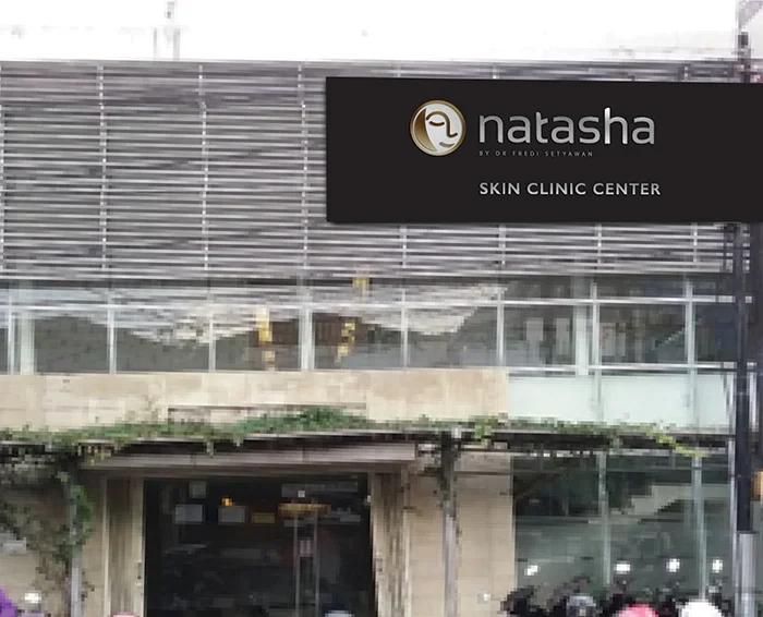
Architecture and Interior
The existing buildings differed drastically from each other, and they had no relation to the brand at all. As we could not change the architecture, the best solution was to put a reverse white logo signage to blare out their name. The black background distracts the eye away from all the surrounding visual noise.


Related Projects


