


SFMA 50
Client: Singapore Food Manufacturers' Association
Job Scope: Brand Identity
A close-knit association with an ambition to expand their horizons beyond our little red dot, the Singapore Food Manufacturers' Association (SFMA) celebrates its jubilee year with the grandeur of a soaring eagle-- a mission to ascend to greater heights. The logo is not just an anniversary celebration; it is a resolution.
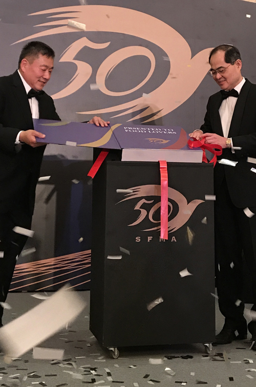
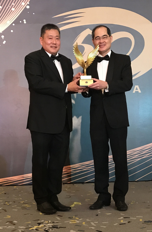
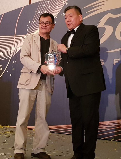
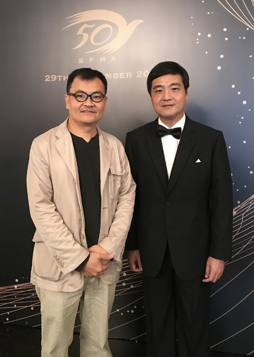
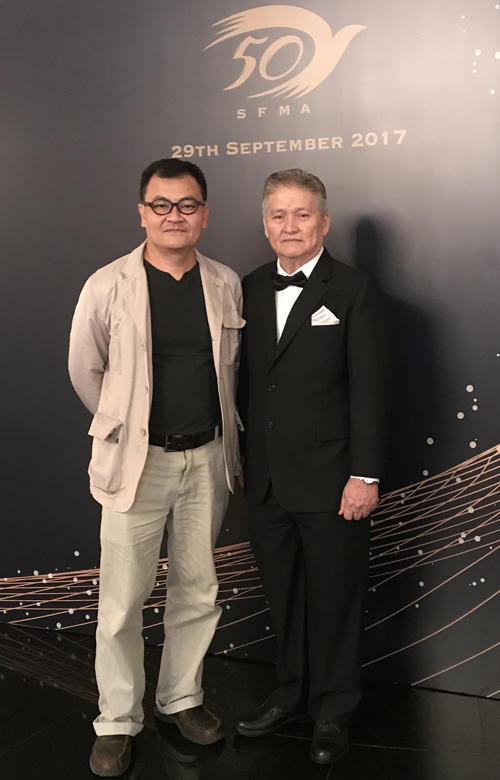
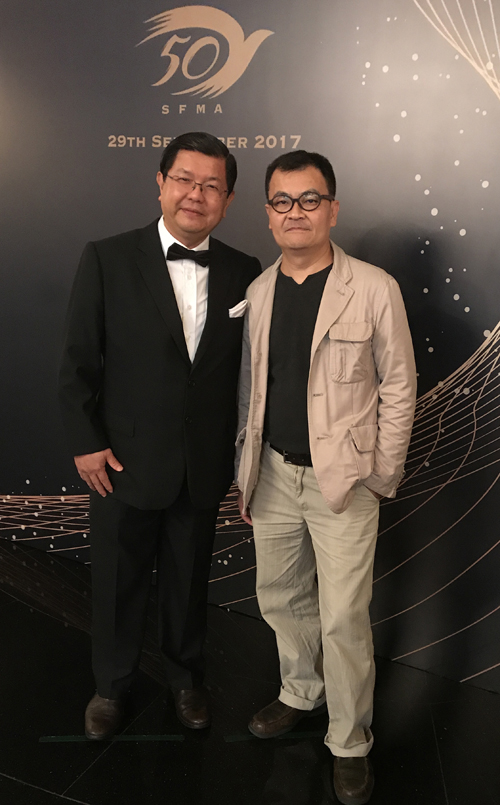
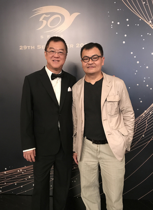
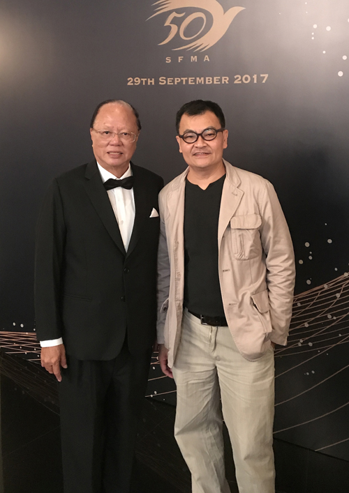
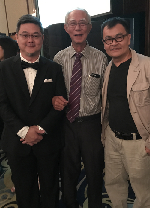
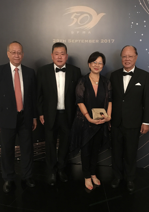
SFMA DINNER Photos


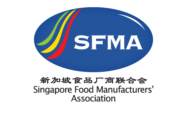
SFMA
Client: Singapore Food Manufacturers' Association
Job Scope: Brand Identity
A jubilee resolution is not complete without a modernised identity for this decades-old association.
This refreshment retained the composition and structure of the old logo to prevent such a steep shock from existing members. The 3 strips on the left, representing cuisines from the diverse races of Singapore, are more fluid, and also shaped to resemble an abstract spoon. The logo is adhered together with the globe-shaped blue background, but now has a flat colour for the logotype to stand out.
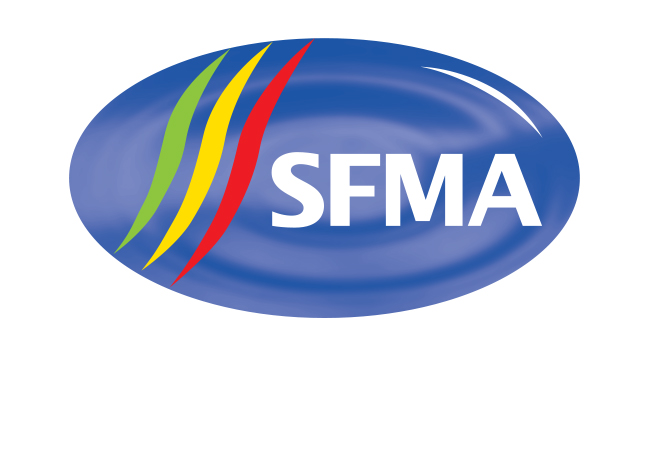
Food Corporation
Client: Singapore Food Manufacturers' Association
Job Scope: Brand Identity
A sub-company of SFMA, with an adaptation of its logo. Instead of a blue shape, the three stripes alone form a globe-like swirl, simplifying the whole identity for easier recognition, but still relating to its parent company.
Summary Block