
Swee Heng 1989 Classic
Client: Swee Heng 1989
Job Scope: Brand Identity, Interior Design
Swee Heng finds its way back to humble beginnings when they opened their first bakery in 1989. Upholding the family business for years, Swee Heng never left their neighbourhood quarters. Only in 20xx did they experience a rapid growth when they opened their first mall outlet. However, with the malls in Singapore constantly developing and setting higher standards for their stores, Swee Heng needs a facelift if they wish to thrive in that bustling environment.
Simplicity in Numbers
"Swee Heng 1989 Classic". What a mouthful. The obvious discourse was to follow their original hierarchy and prioritise "Swee Heng". However, upon first glance, such a Chinese name would limit the culturally diverse bakery to a Chinese audience majority. Torn between keeping their decades-old name and catering to Singapore's ethic mosaic, Orient Design settled with language fluid numericals '1989' as the star, eliminating potential language barriers and shortening Swee Heng's name into a catchy array of numbers. A solution that killed two birds with one stone.
Proposals

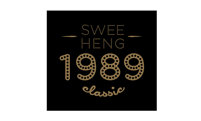
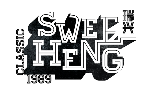
Design 1 (Selected by Client)
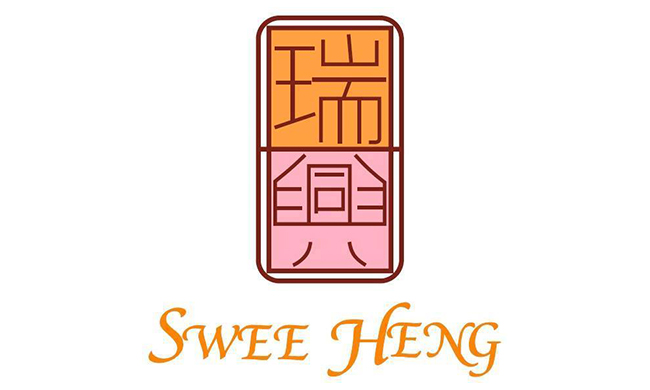
Design 2
Western-inspired with a playful rounded typeface. This logo brings us back to the 80's with a hint of playfulness.
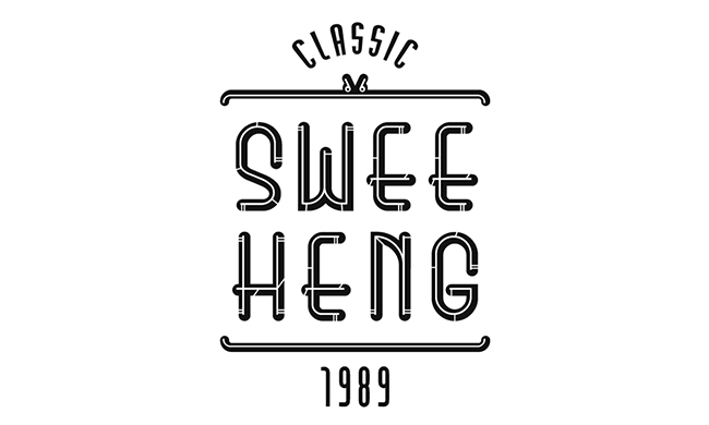
Design 3
A confident and quirky wordmark, that not only makes the name memorable, but also appeals to the younger generation.

Design 4
With a classic font inside a tight badge lockup, this logo propels the brand from a neighbourhood store to a premium bakery.
Old World Charm
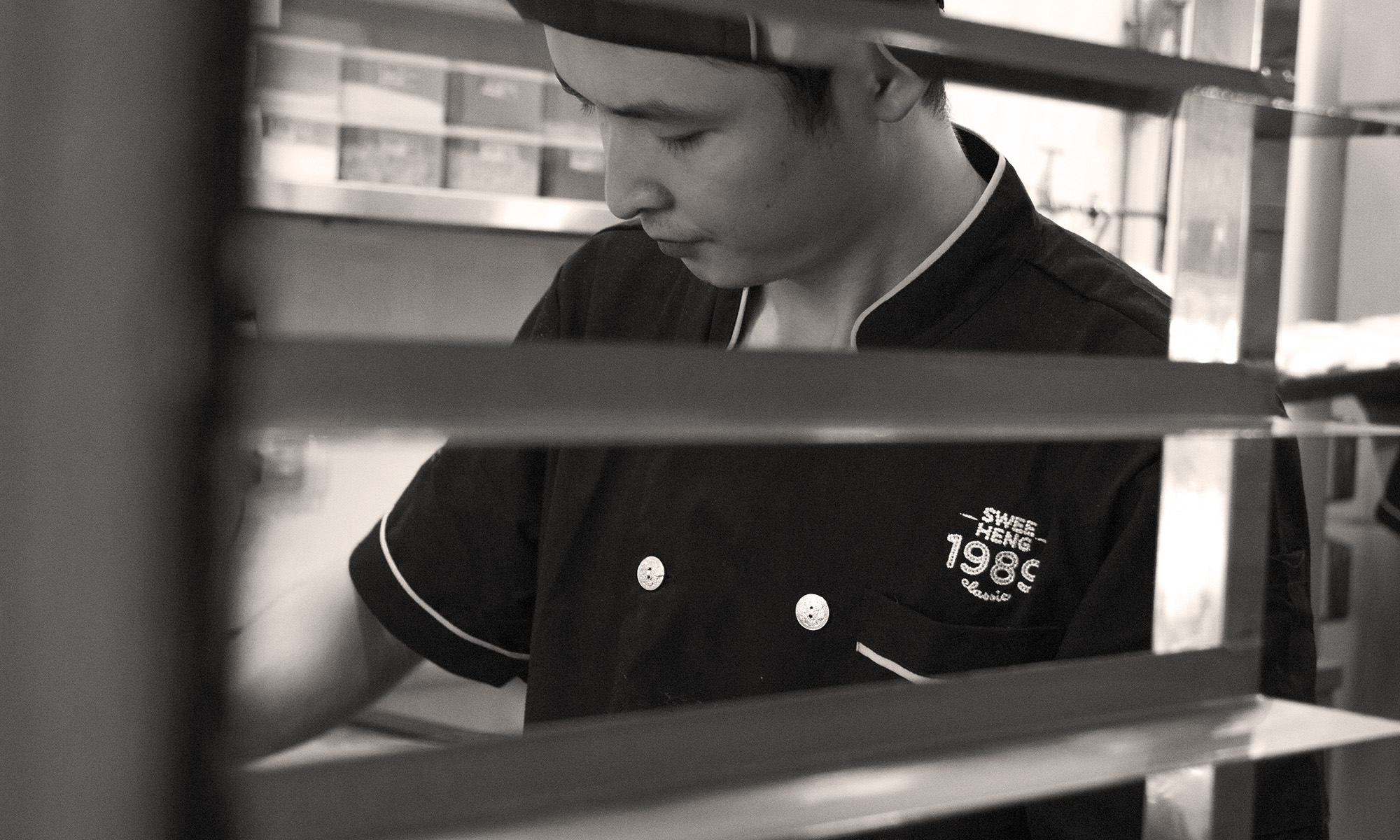
Swee Heng takes the turn back to the past with their traditional photos of bakeries in the 80's. These sepia time capsules capture the time when Swee Heng was no more than a humble 650sq ft bakery, giving their bread the warmth of a homemade touch and their store a gust of nostalgia.

Summary Block