

Poke Theory
Client: Poke Theory
Job Scope: Brand Identity
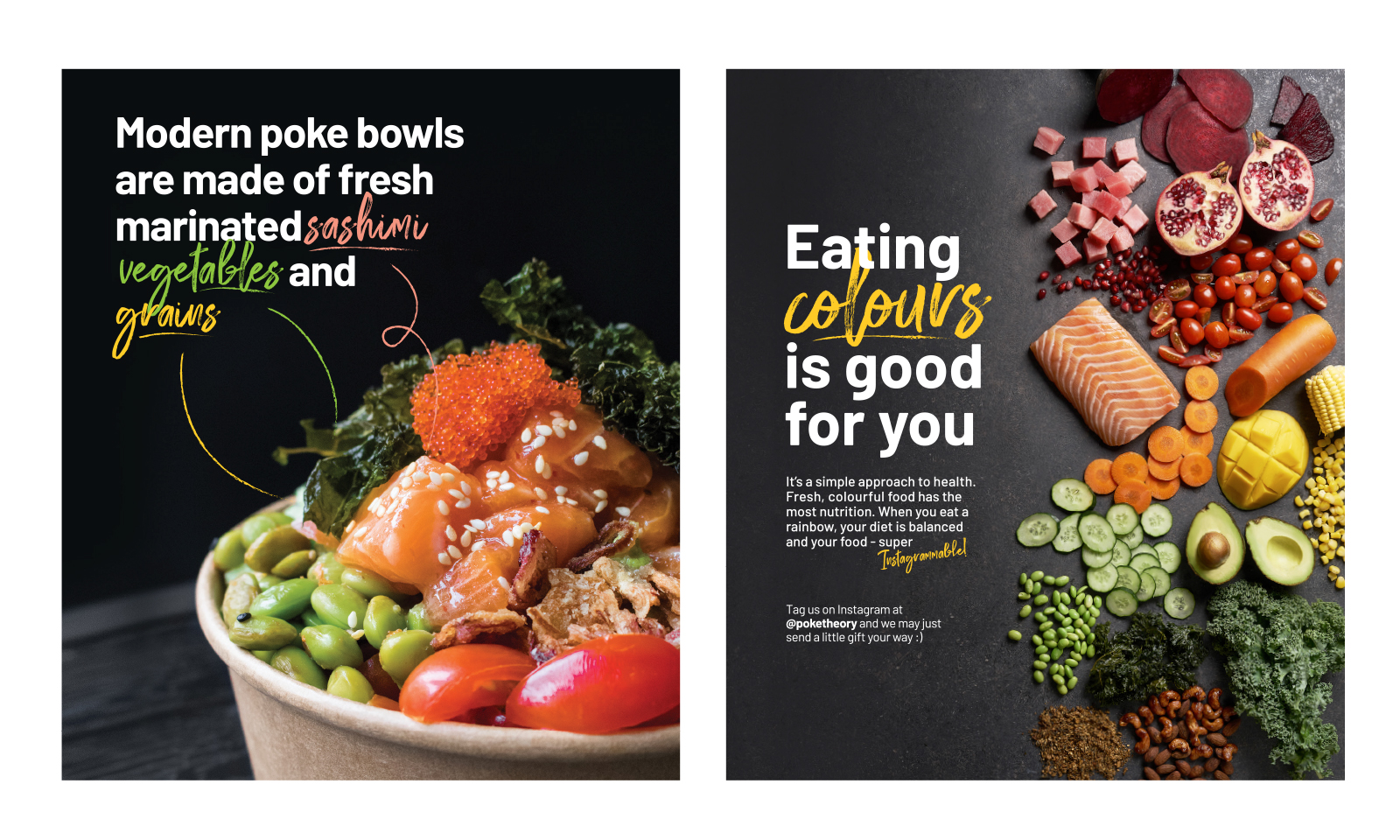
Poke Theory (pronounced poh-kay) is a non-traditional haven for the adventurous foodie. Introducing a rainbow palette to Singapore’s market, Poke Theory celebrates the diversity of nutrients in our food pyramid with a colourful feast. Although undeniably heathy, Poke Theory aims to position their nutrient-packed bowls outside of the health-conscious market for everyone to enjoy.
Logo Proposals

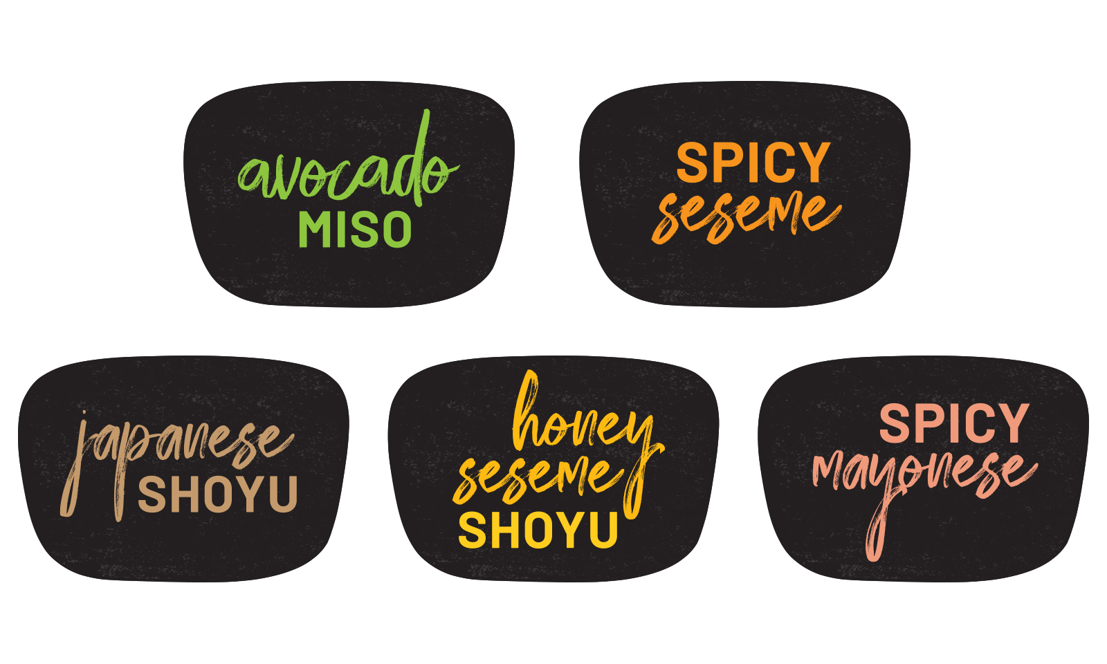
Design 1 (Selected by Client)
Poke Theory maintains an air of classiness with a jet-black branding, accented by pops of colour every now and then, effectively letting their ingredients’ natural colours shine when the logo is applied to other brand collaterals. The delicate approach with stencil-like typography gives the brand a contemporary image.

Design 2
A colourful display of ingredients within the ‘O’ allows people to understand the key ingredients of poke upon contact with the logo.

Design 3
The thick strokes in the logotype give the brand a hearty feel, just the right feeling after a good bowl of poke.

Design 4
Another version with stencil-like typography, this time with thinner, more minimalist strokes.

Design 5
Rounded edges soften the look of the brand, at the same time adding a splash of fun, therefore appealing to demographics outside of the typical “health conscious” range as well.

Design 6
A more elegant approach to stand out from the typical bonhomous look of healthy food brands.

Design 7
A modified version of stencil typography. The contemporary strokes give each character a unique identity for ease of memorability.
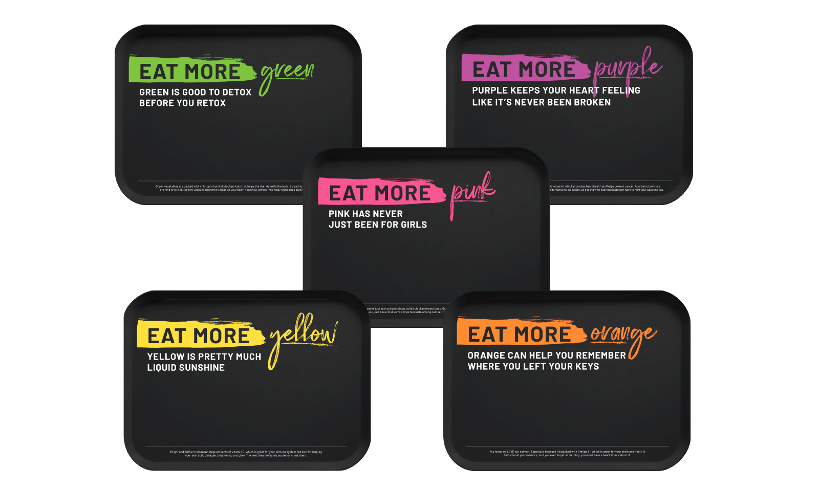
Eat Colourful
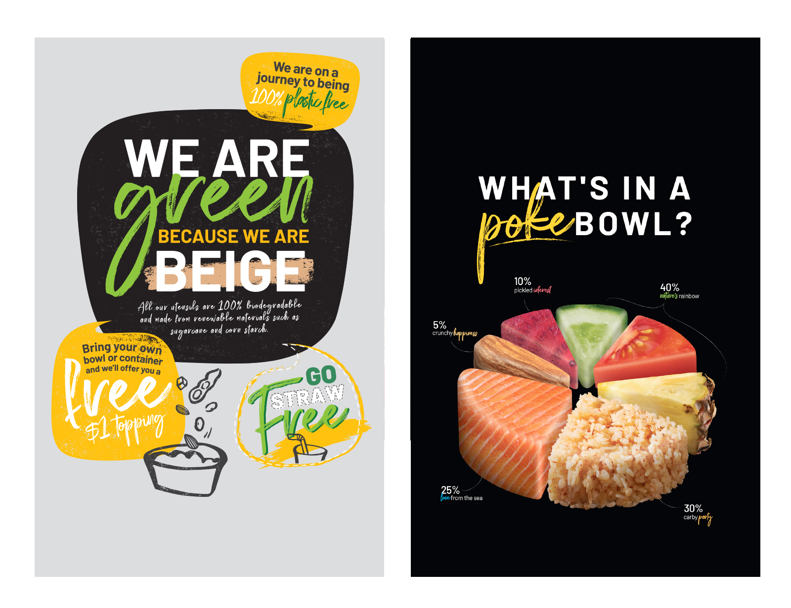
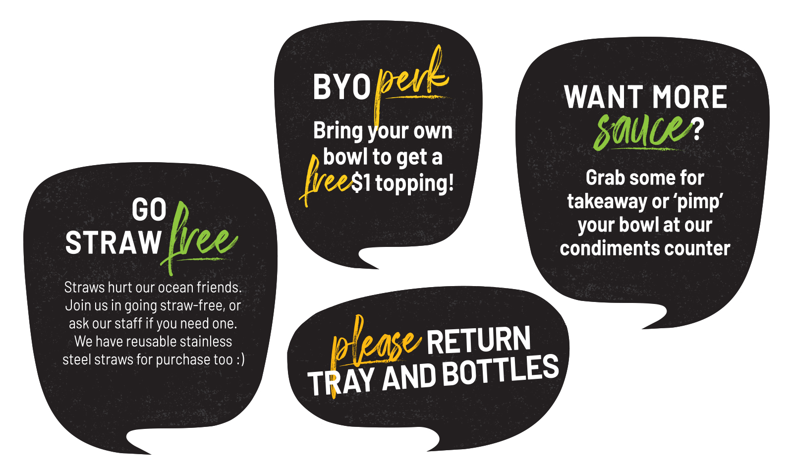
As poke is a dish of many ingredients, the strategy was to highlight their natural appeal and not innundate the visuals with too much clutter. Therefore, black was used as the brand's core colour to give room for the colour of the ingredients to shine.

Related Projects


