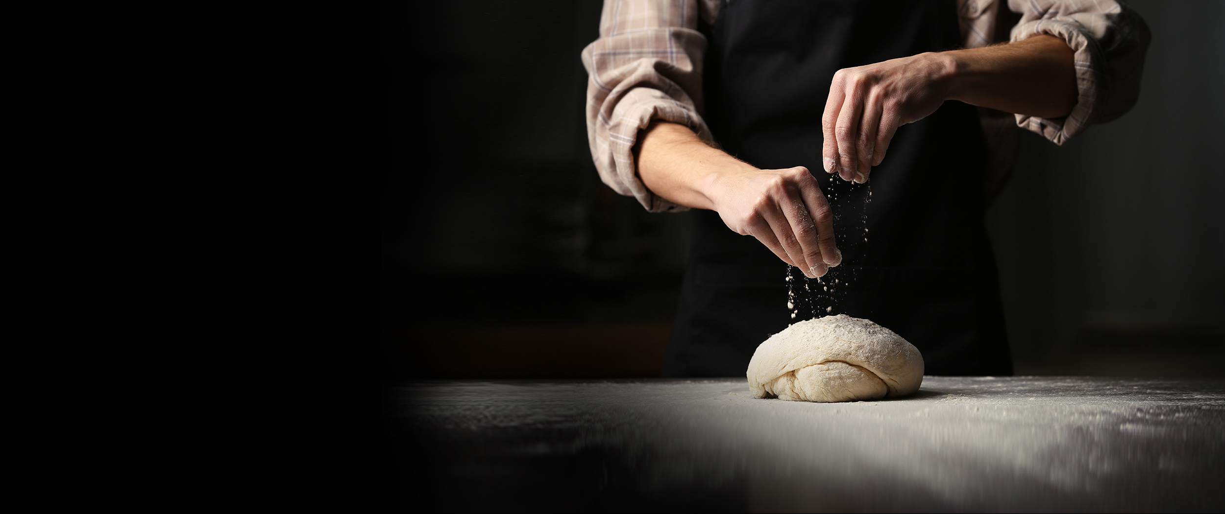
Food Packaging design
One of our top and most familiar categories. Simple, tasty, and filling, food packaging is our result-oriented responsibility to invigorate an existing or new brand.

One of our top and most familiar categories. Simple, tasty, and filling, food packaging is our result-oriented responsibility to invigorate an existing or new brand.
Responding to the new brand extension of Baker’s Oven’s products, the design follows an unconventional direction focusing on the incorporation of different tastes. While their competitors attempted a straightforward approach to their branding, Baker’s Oven sets itself apart in its positioning by highlighting the plentiful ingredients of their product. Being wholesome and colourful, the design allows for indulgence via a harmony of flavours dancing fluidly on taste buds.
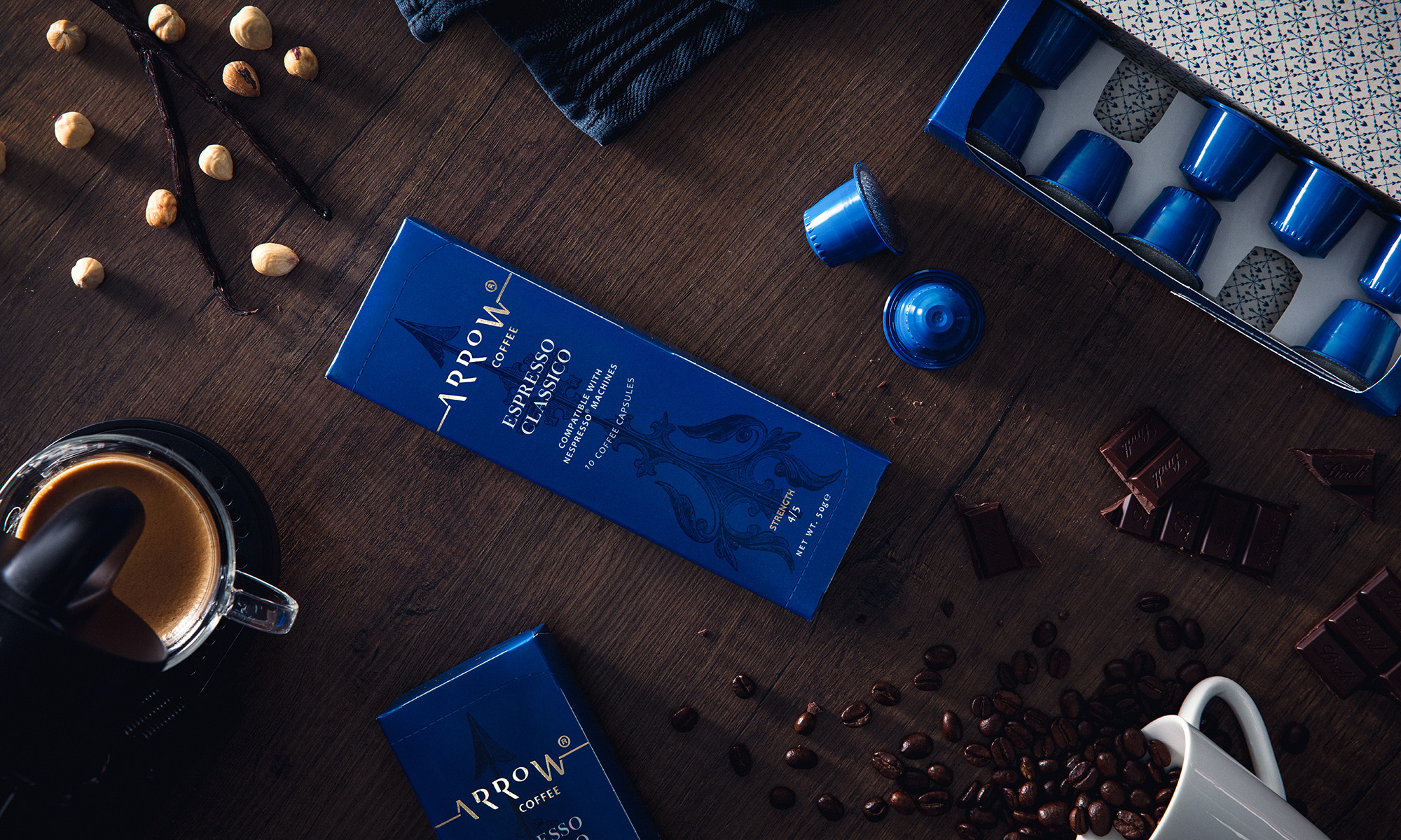
The brand positioning of Arrow Coffee skews towards being a premium product for urban professional consumers. The packaging rebranding aims to achieve a sophisticated brand image that engages their target audience. A classic arrow watermark blends elegantly into the background, relating to a sense of warm relaxation and urbanity. Emphasising on superior quality-taste, the product kindles a flame of quiet comfort in the hearts of consumers.
Sunnyhills is a Taiwanese brand that sells pineapple tarts internationally. Their brand strategy was to commemorate SG50 in order to appeal to Singapore consumers. The elaborate illustration of Singapore’s cityscape that flows over the edges fluidly, depicts limitless continuity and progression. Along with that, the spirit of the country is manifested by bright red which welcomes peaceful celebration and festivities among heartlanders.
A manufacturing company, Colada, produces healthy biscuits. The challenge is to position the brand in both regional and China markets through brand naming and identity with a new product line. To entice the target audience, the strategy was to approach with a series of branding packaging designs. The name, Colada was derived from the vibrant, buzzing colours of Latin America while drawing influences from English tea culture. The overall vintage style depicts immersion into peaceful tranquillity amidst the everyday, bustling urban jungle.
Nyee Guan is a company that revolutionised the conversion of hand-made fishballs into a mass manufacturing process. This convergence of tradition and technology provides availability without sacrificing taste. To align their brand values to the brand image, the design uses an oriental approach. Through the stroke, it signifies both the organic nature of the products and the premium industrial aspect of the brand. The marriage between heritage and commerce cultivates a satisfaction of balance inspiring consumer contentment.
GB nougat seeks to refine their brand image through brand naming and identity. To re-evaluate their brand name, simplifying it to GB nougat would be easier to remember and pronounce within the international market. The logo represents stability and strength to promote trust in their product along with the red that was injected into it. The bright, saturated colours further cultivate a sense of excited reliability in GB Nougat allowing for a feeling of vigour.
Chng Kee offers two tourist bundle packs which cocoons a national and cultural taste of Singapore, Chicken rice. A sentimental approach was taken to emphasise the essence of the country’s Peranakan and food heritage. Cherished memories are intertwined into the design, portrayed by a media of traditional colour pencils. A slice of Singapore was encased in the packs for tourists to bring home, reliving the country’s signature food culture while allowing for hidden inclusiveness and recollection.
Tai Hua is a well-known brand that offers a wide array of Chinese soy sauce. By redoing a brand identity, it will strategically be able to stabilise Tai Hua’s brand positioning for international markets. The prominent orange gradient stimulates enthusiasm in regard to Asian cuisine. Profound lifestyle elements manifest the enveloping pleasure of colliding yet harmonious tastes after being topped off with the product. This opens up a new realm of opportunities to seek out different flavour profiles.
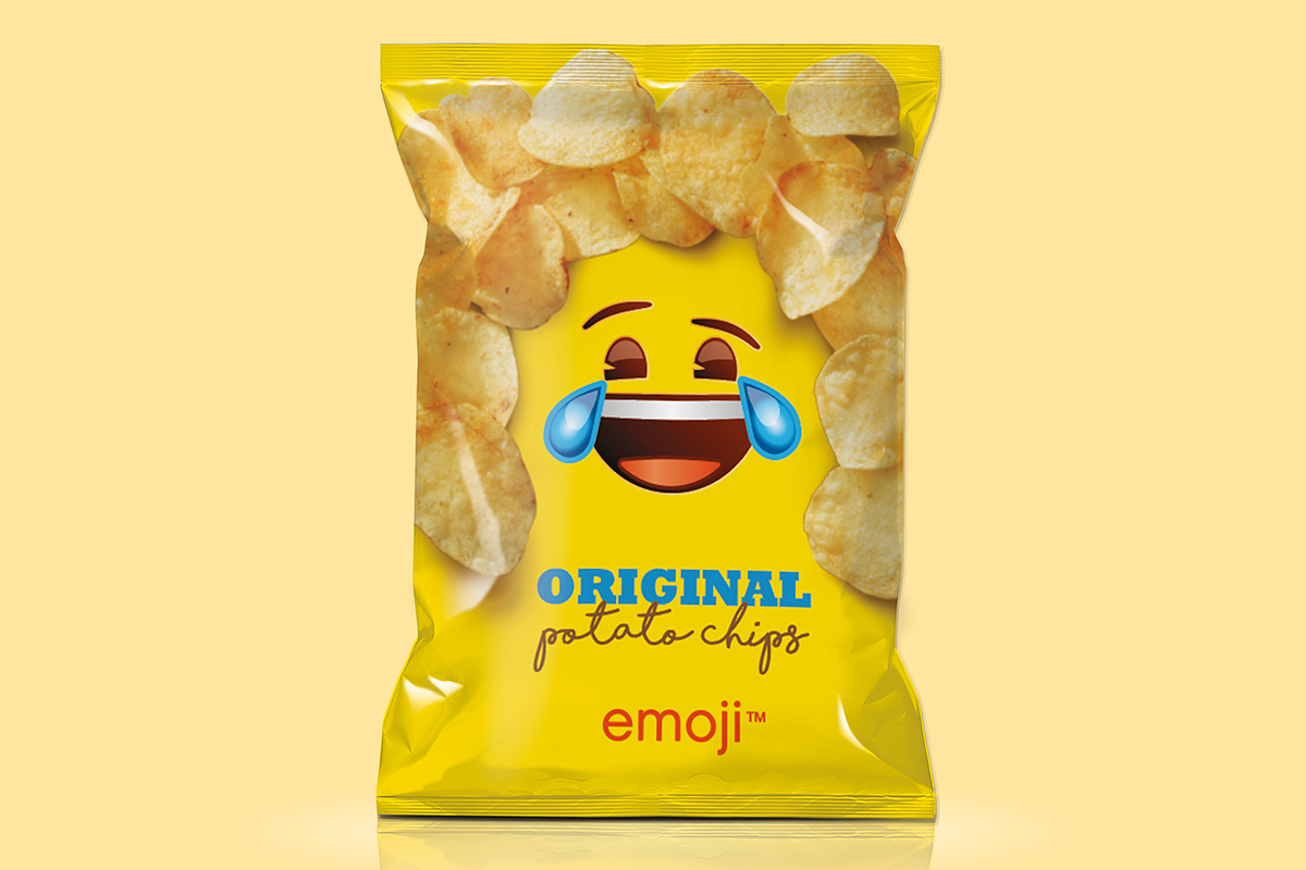
Emojis are playful, fun and have a solidified brand image, which proves to be a challenge on the approach of the design. The expressions are carefully selected to match the corresponding flavours, relishing the essence of emotions not just mentally but physically through the palate. The chips are arranged tactfully as representation of hair to personify the emojis, hence enveloping consumers in the true spirit of the emotions portrayed on the design.
Frozen foods are often overlooked because of how similar they taste to each other; an affable and down-to-earth approach was taken to make a name for themselves in the market. Red is a prominent colour to represent the passion and generosity of flavors that the product contains. The brand name, Bagus, means “good food” in Malay which brings forth happy enjoyment that manifests in the spirit of sharing and consuming the product.
Liang Pin is a company seeking to strengthen their position in the market as well as cement their brand image. Focusing on simplicity in their image and distribution, the logo makes use of Hanyu Pinyin in a shallow yet bold way for easy recognition. It depicts the strength and reliability of the company and its services. The appearance of the text illustrates an organic, grainy effect, emphasizing on the secure chemical-free nature of their products; building a steady reliance.
Camel Peanuts is a well-known brand in Singapore. As an established brand, they seek to standardise their identity in Asia. A deep maroon is used to represent a sense of elegance, enveloping consumers by savouring each flavour of the different peanuts. This direction focuses on the uncomplicated, simple enjoyment of peanuts. The peanuts are intentionally paired up and placed to the side to create definite yet simple shapes for easy identification between the many products, ensuring consistency.